More Manual Artwork Progress
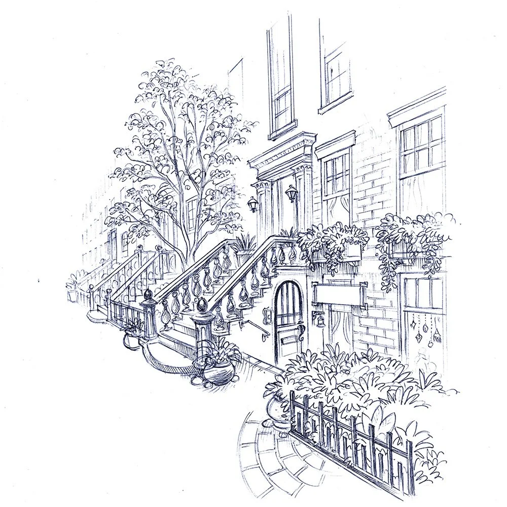
I’m always excited to show Karen’s work on this project. Below are a few pieces for the manual in the line work stage of development. Karen does remarkable color work, but the general vibe for these illustrations will be toned down in their color details.
If you’ve been following the project for a while, you’ll know I’m going for a bit of a 1960-1980’s vibe with the artwork and design. You can see that aesthetic reflected in some of the mood board I put together a while ago. The artwork for the old Three Investigator novels are a strong style touchstone https://www.pinterest.com/aubreypullman/ghosts-lanterns-mood-and-style/the-three-investigators/
Manual Cover
A larger image of the Seabrooke mansion.
Inset illustration of the Theophilus & Vance office.
The version in the manual will be more “zoomed in” on the door under the stairs where the entrance to their offices are. The sign will be filled in with their business name in the final revision.
I treated myself to a large format color printer for my birthday (hint: it was a big one -the birthday… and I suppose the printer), which has me back on thinking I’ll produce the prototypes in house instead of sending them out. This means I’ll be able to make more or less as I need them, but the boxes will be a bit tricky, and the card paper won’t be quite the same. Maybe I’ll use really big envelopes? I’m still thinking about it! For now, I’m going to do some tests while I wait for Karen to finish the rest of the sketches for the manual.


